Spellington diary - Entry 5
It is really hard to make an impact in the Play Store, let alone stand out among the myriad, literally millions of existing apps.
I believe Spellington is a nice app. Snappy, good looking, and more importantly, useful. Introspecting into the app, I found some huge improvement opportunities.
Text to speech
The most important improvement opportunity the text to speech engine. While the browser version of the game has a great text to speech engine, the one bundled in most Android devices, specially medium/low end or older ones is not as good. For example, my 2016 samsung tablet sounds brutal for US accent, while the UK one is ok-ish. Worst of all is that some letter pronunciation, like j and g, are not correct, which is terrible.
TL;DR the core functionality the app relies on is text to speech, and it was not even fine. To fix this, I have used some AI. Google's Wavenet 2 has resulted to be a fantastic tool to synthesize all in-game words. A single script allowed me to build the sounds in roughly 5 minutes (granted that google has a rate limiter of 1000 requests per minute).
The app now ships with 1841 high quality sounds in three english accents being those US, UK and India. The quality of the sound as improved 100x at the cost of adding 20Mb to the application bundle. Other drawback is that custom lists don't benefit from pre-recorded sounds, but this could be a nice premium feature (if such a version ever gets to exist).
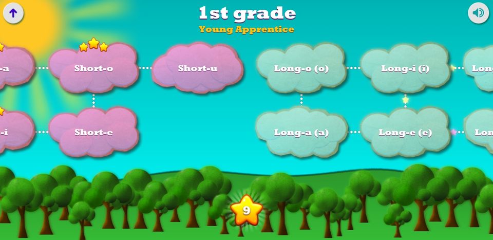
Spelling Lists Navigation
Another improvement opportunity is each grade's spelling list navigation system. While I originally though the lists looked great, and in fact they did with that candy-cotton look, I did not realise they posed a clunky clustering mechanism. I decided to group the contents in a more meaningful way, where kind-alike lists get clustered together with a homogeneous color. The result is that I don't need to read each list anymore to know what they are about. Here is a before and after:
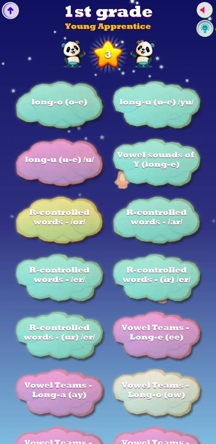
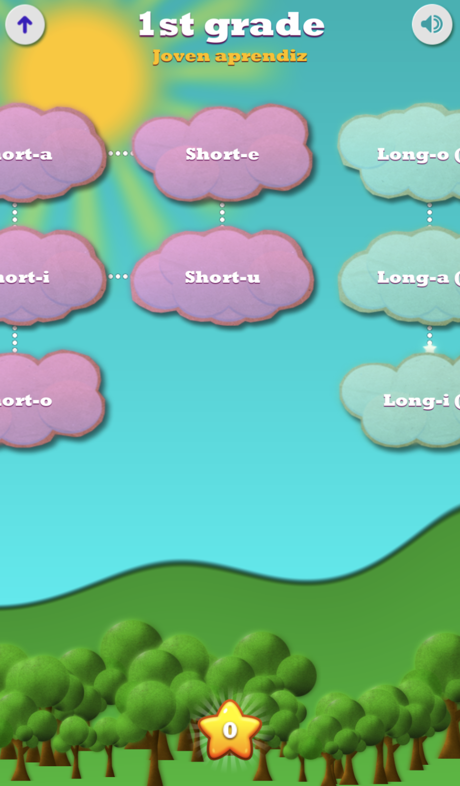
1st grade Spelling list navigation. Before and After.
Grade selection menu
Less important than fixing grade list selection, was the grade selection screen itself. Grade selection is the first screen the user would see. While making the analogy of planets as grades made sense, the screen layout itself was hard to get in one sight. The user needed to go find what each planet was meant for. The background was dark, though it had an animated star field (more space type decorations). But most importantly, It did not scale well. If I wanted to add any other type of in-game activity, I'd have had a hard time.
For that reasons, I decided to go with a radically different approach: bright colors, and the least effort possible to identify the contents, e.g. well aligned elements, swipe gestures, card background animations, etc. It now feels more natural and I could add new activities just by adding newer cards. Judge by yourselves:
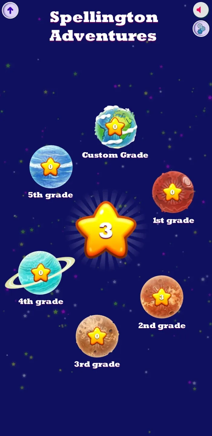
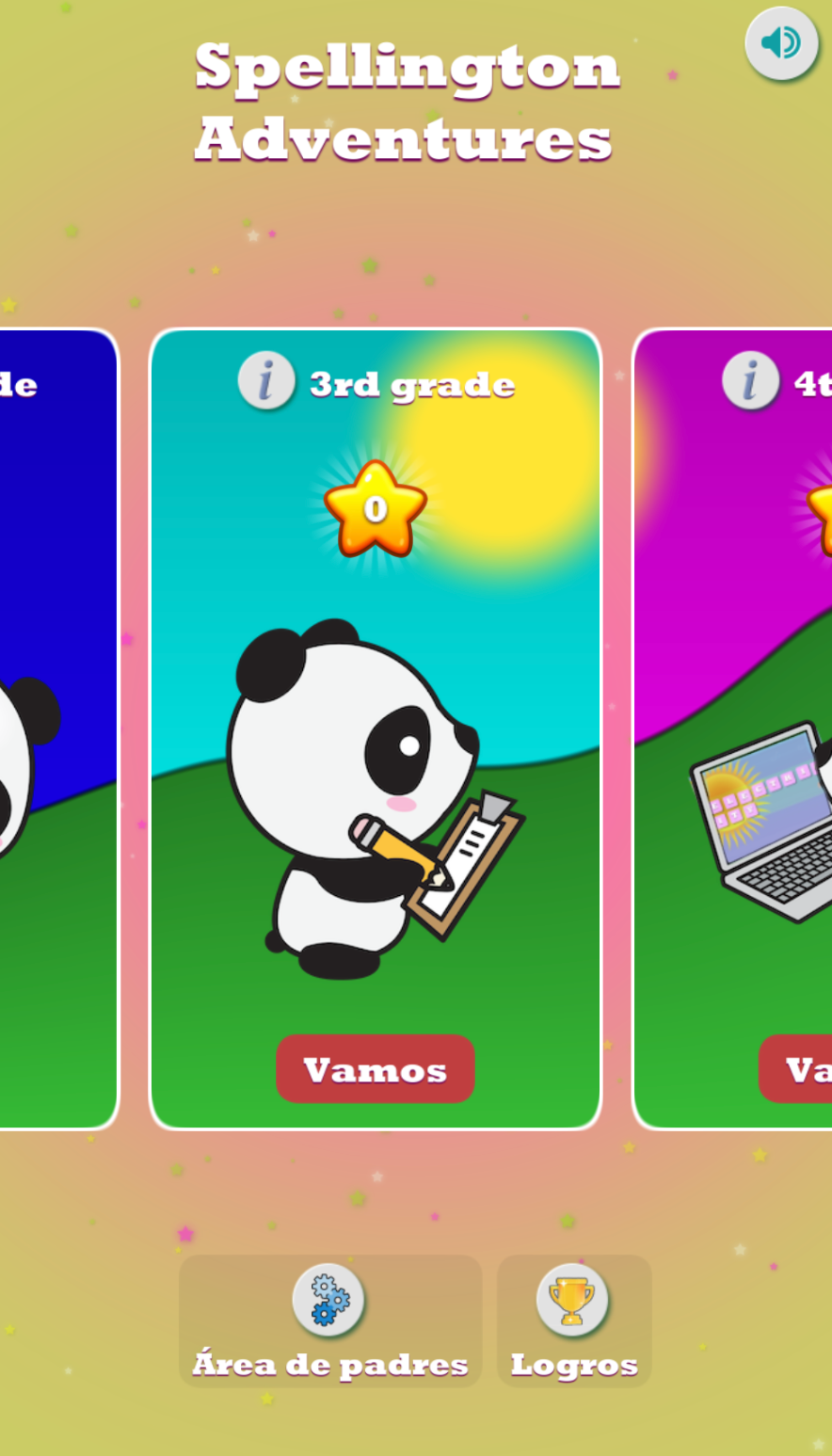
Select grade. Before and After
Would love to know your thoughts.
Thanks for reading.