Spellington Diary. Entry 3
The app is evolving very slowly. The Linkein post is stagnating around 3000 impressions. Right now it shows 3345 impressions and registers 50 interactions.

I got revoked the `Teacher Approved` badge. For a solo dev and designer is a hard outcome. I lack the resources to attend the recommendations they gave me. Somehow, I expected to have more time to address the recommendations but that is how it ended being. Bye bye badge. It really sounds like a sad song...
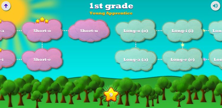
I have decided to make the app more kids friendly. I hope to make it look less like homework, and more like something fun. I have started by removing the planets at the game start. This is the game start screen:
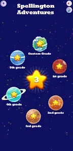
Each planet directs to a grade's lists. I have plenty of reasons for this change, but TL;DR:
- The aspect is not as friendly as I thought at the beginning.
- It does not scale. As I plan on adding more mini games, in the planets analogy there is simply not room for something that does not fit the grade model.
This is probably going to be the new game start screen:
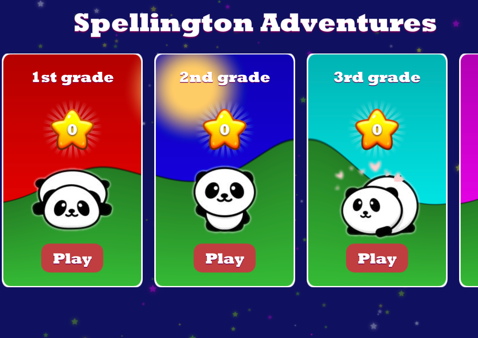
The mountains and sun pan around, the stars have a rotating halo. I don't want to add too much movement to this screen. Maybe the Spellington images will remain still. Or just a two frame animation as much.
I'd love to hear from you with feedback or thoughts.
Thanks for reading.